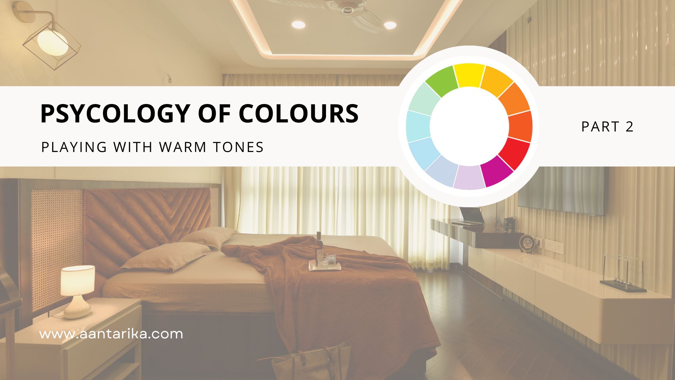
Psychology of Colours:
Playing with Warm & Neutral Tones (Part II)

Well well, look who’s back!
Our previous blog, Psychology of Colours (Part I) discussed the cool tones
in interior designing and the impact they have on changing everything about
an interior of a room. If you haven’t checked that out then we recommend you to!
With that, we welcome you to Part II of this series, where we will be exploring warm and neutral tones respectively. So, sit tight and grab a pen!
To properly utilise every inch of space in accordance with the sentiments and emotions each colour evokes, colour psychology is a fundamental component of interior design. It serves both aesthetic and functional goals.
What are Warm Tones?

Colours like red, orange, and yellow are typically seen as colours that arouse sentiments of joy, optimism, and vitality when they are used with artistic ideas. The living area, dining area, and patio are excellent examples of common areas in the home where these would work well.
Red: The Primary Colour
This is a bright, warm colour in interior design that is undoubtedly best
suited for people who like strong design elements. Red can signify vigour,
sexuality, and power. The appropriate tint of red can increase your vigour and
make you feel excited and energised. Since red possesses such complexity,
it is frequently used as an impact colour in fabrics or furniture as having
entirely red walls in confined areas may feel overwhelming.
Red is a fantastic choice for private offices and artistic areas since it is
closely associated with values like ambition, activity, and determination.
Yellow: The Primary Colour
Want to bring some light into a cramped, gloomy area? Yellow is like a sunlight
alternative in places that lack an adequate amount of natural lighting,
which is frequently associated with sentiments of positivity and joy.
This type of yellow may make you feel more upbeat when you enter a kitchen
or restroom, giving you that extra bounce in the air.
Whimsical yellow hues go great in nurseries and children's bedrooms,
yet the colour can be equally sophisticated and looks great in almost
any interior space that one would like it to. It must be the proper
shade of yellow; nonetheless, if it is too bright, it may agitate you,
and if it is too pale, it might make one feel dull.
Orange: A Blend of Red & Yellow
In interior colour psychology, orange is considered to evoke a happy,
upbeat sense of excitement. Orange is energising and creatively enhancing due
to its vibrant and vivid hue. According to studies, the colour orange can
trigger positive physiological reactions such as an enhanced sense of activity,
improved socialisation, a rise in the flow of blood oxygen to the brain,
and a boost in thoughts of joy.
Orange is a fantastic choice for at-home workouts or just about any situation
where you're looking for a zest for life and an attitude boost. Using softer
interior design colours like peach and apricot will help control the colour,
as an excessive amount of strong orange is likely to be overbearing in any setting.
Now let us look at some neutral tones!
What are Neutral Tones?

Neutral colours in interior design are subdued tones that give the
impression of being colourless but frequently have base shades that
shift depending on the lighting. The colours beige, taupe, grey,
cream, brown, black, and white are a few examples of neutral hues.
They not only make room for other colours but also accentuate them.
Selecting a neutral colour well gives depth. This gives the room a
deeper and larger appearance, hence particularly helpful in designing homes.
Their strength is in their adaptability; you can add colours to spice
everything up or take it away for a more subdued feel.
Black
Despite being frequently associated with gloom in popular culture, black
in colour psychology stands for strength, mystery, dimension, and drama.
Black has the potential to fit in any setting while providing equilibrium
and sexiness due to its neutral appearance. When used properly, black is a
terrific choice for accents, wall colours, furnishings, equipment, and even hardware.
Employ black to bring attention to thoughtfully chosen,
distinctive pieces because too much of it may be overwhelming and make a space appear smaller.
If you're determined to make a sombre, dramatic atmosphere, choose a location that gets
ambient light and counteract the darkness with white or similar brighter/lighter colours.
White
White happens to be the most adaptable colour to employ in interior design,
connoting sentiments of simplicity, cleanliness, and purity. In the last ten years,
there has been a revival of minimalist designs, bringing white furnishings, walls,
and fittings more in demand than ever.

With a good interior design company, you can use accent pieces of colour to provide complexity and character to your house. For decorative elements and walls, you can additionally employ a single splash of colour in varied shades or pick colours that complement one another like lavender and pink.
Looking for a trustworthy interior designing company in Bangalore? Aantarika Design Studio has got your back! Get in touch with us and revamp your interiors like never before!
~Aantarika - The Design Studio.
